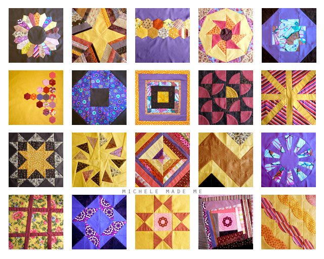
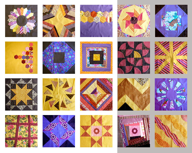
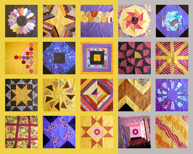
Alrighty… so here are all the blocks for the Craftsy Block-of-The-Month 2012. Yep that’s the lot of them. Finally. Crazy how long it took me to finish them all. But hey, it’s all good. Better late than never, as they say.
Given that they are a titch colourful, I’m in dire need of some expert help… Before I can go on, I need to figure out what what what colour I should use for the sashing. And, just in case you’re not familiar with the term “sashing”, it is that grid that the blocks sit inside. See what I mean?
It could go so many ways… The possibilities I’m toying with are:
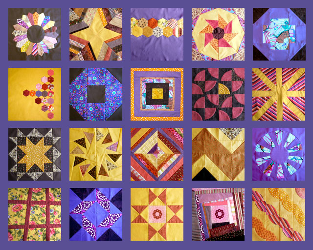
Perfectly PURPLE:
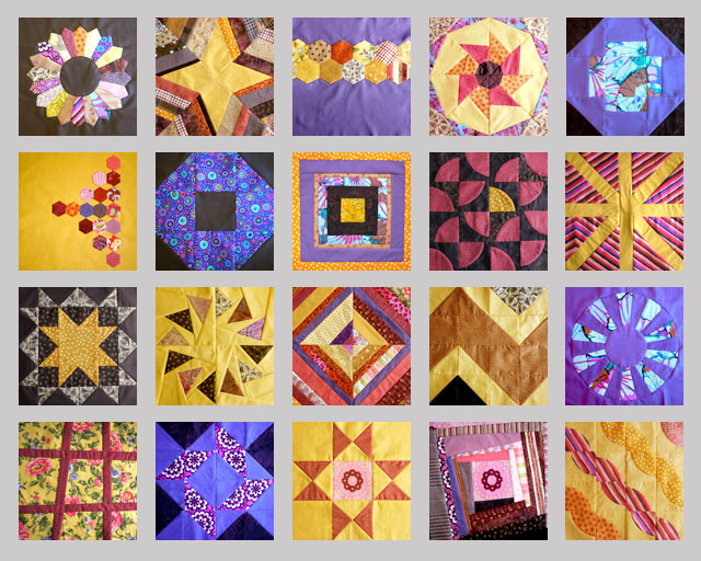
A nice light GRAY:
Your basic BROWN:

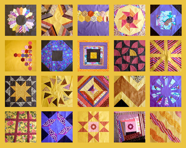
Screamin’ YELLer:
WHITE/GREY mix:
YELLOW/GREY mix:
And just plain WHITE:
What do you think? Ideas, thoughts, suggestions, comments? Let me have it. I’m all ears over here!
♥M
Personally, I would go with the purple. My second choice would be the brown. I like the yellow, too, but it seems like some of the blocks get lost in it. And since you asked, I would not mix the sashing colors, but would go with only one color.
I Love your quilt !
Found myself surprised to HATE the white.
I really hope you weren't leaning that way and now have a total stranger crushing your choice .
I'd go Perfectly Purple.
Not what I would picture myself liking, but when all are laid out and scrolled thru a few times I'm liking the feel of the purple.
Looking forward to seeing after quilting.
Happy Monday : )
I like the purple first. I think I'd go with screaming yellow second if I was feeling brave or grey if I wasn't. I would ditch the brown.
Purple looks the best!
Purple! The blocks look great!
I like your basic brown. It's still enough contrast to allow the blocks to pop. The yellow and purple make it too "girly". eliz.i@sympatico.ca
The blue/mauve is lovely , it makes it look complete . The light colours are also nice , makes the blocks sort of float.
Now lets whisper ! I haven't started mine yet but I'll search my file , if I find them tomorrow I'll make a start .
I like the gray. I think it is the most modern but still classic enough to stand the test of time.
Wow, you did a great job Michele!
It’s not one of your options, but I think a lighter aqua/turquoise would be lovely for the sashing too!
hi michele, i love the yellow best as background, my second choice would be purple ☺ if this is of any help ☺
regards, dana
What beautiful blocks! I like the light grey the best.
Loving the light gray!
I really love the brown
the yellow says spring/summer to me, the brown makes it a mascular quilt, the purple is too much of a halloween feeling for me and the grey and mixes doesn't do it for me… wow what a great help! 🙂
I do like the white. I did find myself thinking that darker border of the brown worked, but not quite, maybe a charcoal grey rather than a pale grey?
My vote is going to purple!
I vote the purple too
I'm voting for brown and then purple.
I vote for that touch of rosey-red that is scattered through some of the blocks.
I think the white gray or white look the best – they allow all the colors to stand out. Although the purple is nice, too. Definitely not the yellow. It makes too much yellow, and the yellow in the blocks disappears. The squares are beautiful!
Noreen
http://craftyjournal.com
Purple is definitely my favorite…
I vote for gray, then brown.
I love the gray, because it gentles and harmonizes with the colors! Also, impressed by the post – how'd you do that? I would probably not understand if you told me – but so cool that you can do such a perfect mock-up before deciding.
The blocks are amazing together!
Ignore everyone who didn't say brown theyare obviously trolls looking to force you into a bad decision
I really like the brown. It makes all the brights POP.
wow, this looks like a LOT of work!
i vote grey.
i agree with michelle l. that it "harmonizes" all the colors.
my second choice would be yellow ♥
The purple gives it a very moody, luxurious look. The yeller is very bright and brave. Love each of the individual blocks.
Hi,
Well worth the work. These are beautiful!
Purple – blends too much; maybe periwinkle?
Brown – I do like it buuuuuut…
White – Nope
Screamin' yeller – blends too much; maybe a more goldy yellow?
Mixing colours – absolutely nope.
Grey – too wishy, washy
How about something completely different? Do you know where you are going to use it? Do you have any colours going on wherever you're going to use it?
How about pink – there are several shades throughout from fuschia to almost baby pink. Not really sure about that, though.
There's a turquoise in there. There's even a coral. Something else I thought of – second row, middle block, I like that gold with the white dots (I like dots.) Where the screamin' yeller got lost this might not. And then there's black but I'm not a black person (just ignore the fact that I wear a lot of black) or navy – a rich dark navy (I like navy.)
I just noticed on the bottom row the third and fourth from the left, they both have the same medallion in the middle. Did you deliberately put them together? Try them apart and see if you like that? Will you wait until you get the sashing before you chose the back?
How about a nice, rich cream – it might wash out but worth a try.
Anyhoo, I probably haven't been any help at all. In fact I've probably just confused the heck out of you.
All the best anyway,
Cathy
All the blocks look great!I like the purple and the yellow best. Here's my thought! All the middle yellow, the outside purple with a grey pattern binding! 🙂 Or yellow in the middle, the outside grey and the binding purple. 🙂
I vote purple!
Did you try a coral or salmon that would match up to those colors in your string blocks? I would try that before any of the others.
If I had to choose one of the color options above it would be the purple. However, I think a black sashing would the best choice. It would allow all your colors to pop and not get lost like they do in the yellow option. All of the blocks are absolutely beautiful. Each one it's own piece of art. You could always choose multiple colors for the sashing.
Or what about red? There seems to be a good amount of it in the blocks but not enough to get lost in the background.
I"am for yellow!!!Very nice quilt!!!
I reckon cos youve placed purple first, thats unconsciously your choice lol
I like the purple best too but thereare some delicate white on white cottons about, with subtle patterning and that could work rather than a stark white contrast.
But no……sumthing in the purple range.
Deffo not mixed making it far more busy and yellow detracts from the blocks and colours.
Good luck lol
Purple
Yellow does make it blend together too much. But I like the suggestion of a yellow with some white in it.
I think black would set it off nicely too.
Hi Michele, if I were you, I would use yellow, it gives it a warm touch and some summer feeling 🙂 The other colours make a too big contrast. And the mixes are absolutely no go! Please don't :)) Keep us posted about your final decision 🙂 Really looking forward to it.
Have a nice week
Sigi
I like the brown.
The colours you've chosen look fantastic together so any of these options would work to be fair. Not so keen on the split options though.
I'm a bit boring in that I think every quilt should have white sashing on it. But to be more helpful, I also like the light grey. I think the yellow makes a lot of the blocks disappear and I'm not a fan of the mixed colours.
Grey, of any hue would just be WRONG in this quilt! Your color scheme is very vivid and warm and the grey would just clash and kill it, in my opinion. I agree with a lot of the other people's thoughts on PURPLE. But I would do corner posts too, which would break up the color a bit. And my first choice for that would be yellow (or maybe black) In squares no bigger than 2". These turned out great. Can't wait to see what you end up doing.
…I just looked again, with the quilt in the lightbox and almost think yellow this time. If you do yellow, maybe do corner posts in a brown or purple. I didn't care for the mixed up ones…
I am for the screaming yellow!
Tastes differ so much so maybe we won't help you in deciding about this 🙂
However, I am amazed{!!} how beautiful the squares turned out to be!
Amazing work Michele!
One word, purple!
I like the purple, but wish it was a deeper almost blackish hue to contrast and highlight the blocks.
What about Black???
i love the purple – but black or maybe turqoise. Please be sure and post a pic of your decision.
Beautiful blocks, Michele! And I loved reading through these comments and seeing all the different takes. I'll add my vote for the purple – I think it calms the overall color profile a little, and seems to best allow my eye to take in each block. (And I agree with others who say you could even go with a bit darker shade.) I wonder whether a little wider sashing strips might also be a good balance for the visual complexity of your blocks?
I can't wait to see this finished!
I might be prejudiced because yellow is my favorite color, but I really do think the yellow brings out the colors best.
I think the brown made the colors pop most – black would also do so, I think, as would a dark grey. The grey you've shown seems too light to me though. Absolutely beautiful squares!
Thanks for sharing this beautiful quilt. I'm starting the 2012 quilt block of the month now and was feeling like I didn't want to stick with just one solid background color so this definitely gave me the inspiration I needed.
For the sashing my vote is definitely the purple. It pulls the whole quilt together in a way that the other colors don't (at least for me). My second choice would be the light gray.
Can't wait to see the finished quilt!
I love the color. It is really playful. What a beautiful job and a LOT of work. I love both the yellow and the grey border…separate, that is. The yellow, though bright, seems to tone down and unify the brightly colored blocks. The grey border modernizes and also unifies it. I love the purple in your blocks, but I think the purple border is too much purple. I'm sure whatever you choose, the quilt will be beautiful!
I'm a bit late commenting here but I'm afraid I'd go with the purple too. At least you're on the right track now 🙂